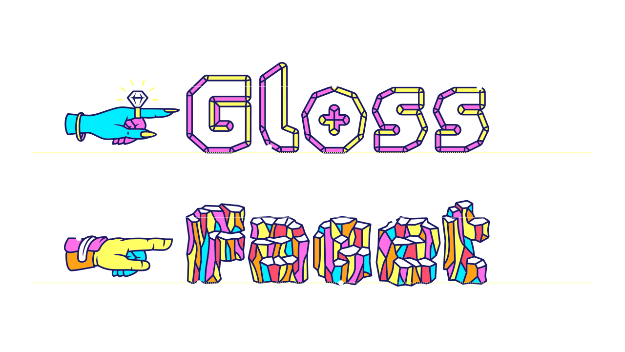
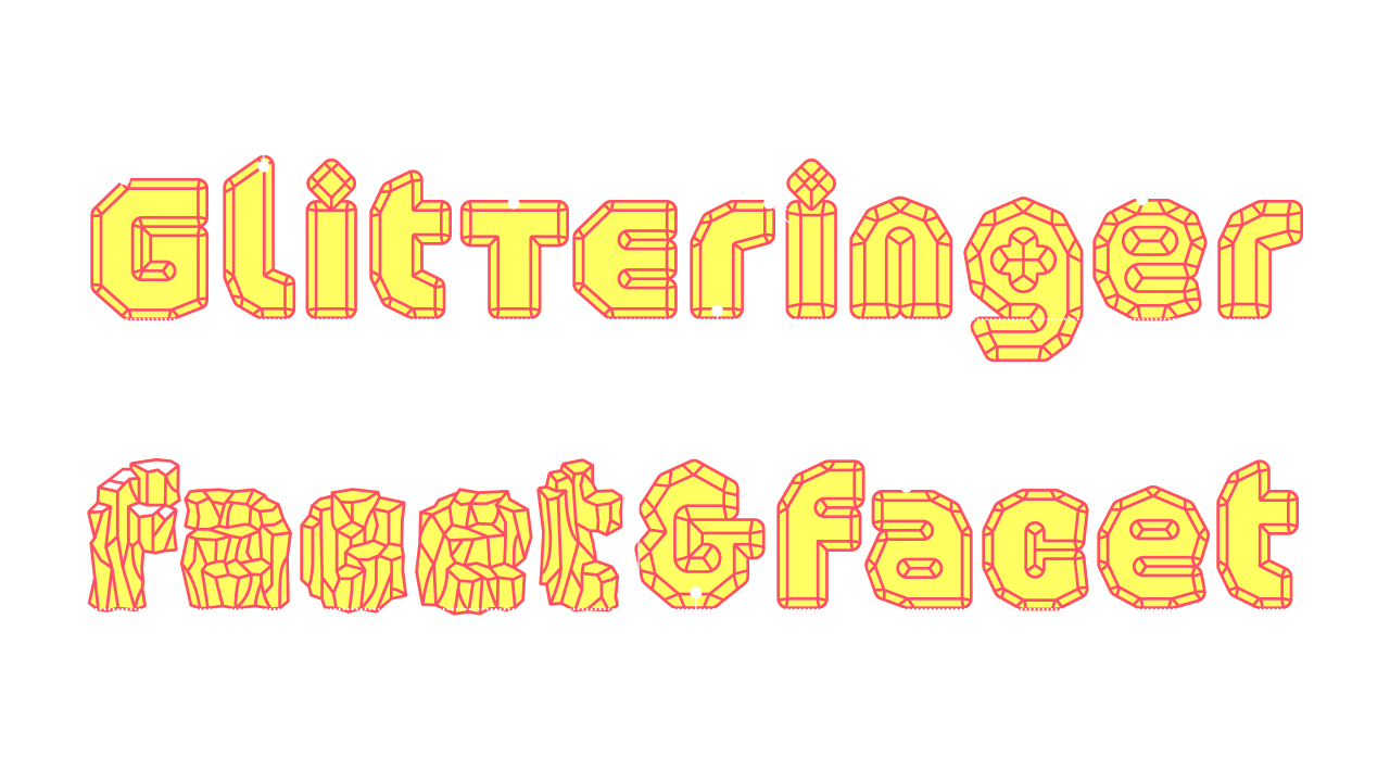
A multifaceted gemstone font
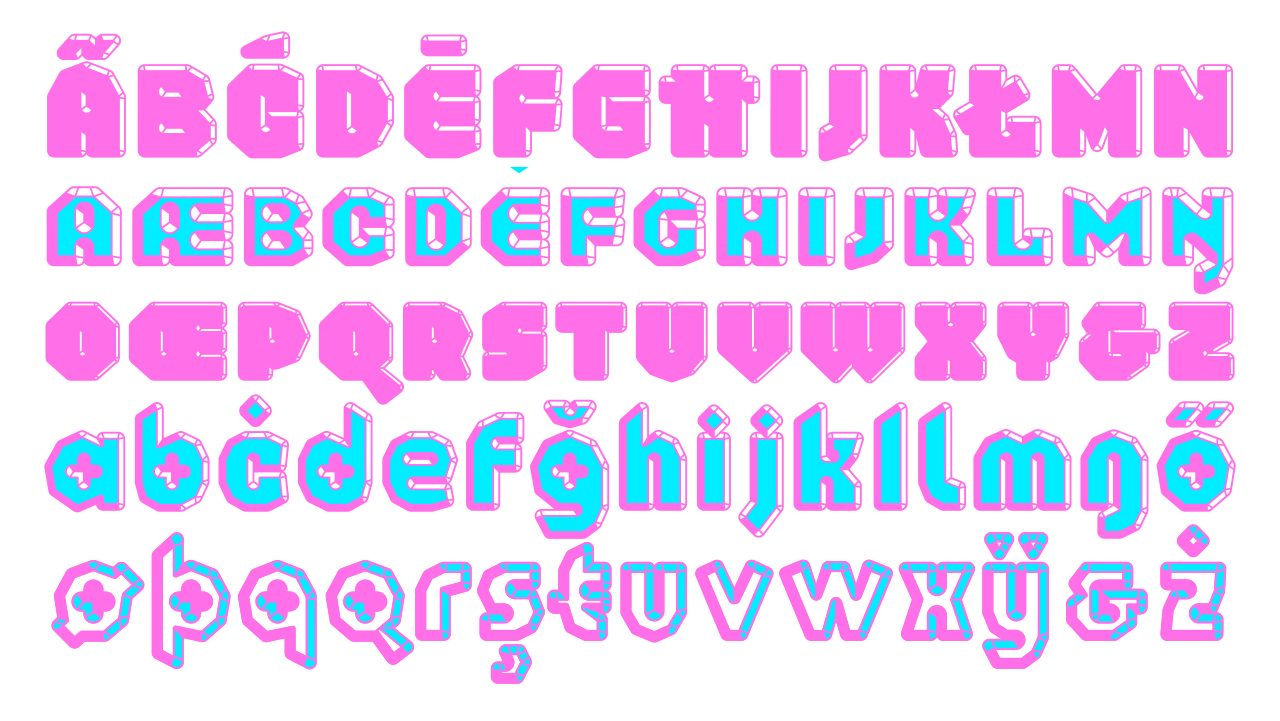
Schijn has strong foundations for it’s facets and bevels, using gemstone cutting techniques and raw gemstones as an inspiration. Rough and chiseled styles play with readability and decoration, creating shining letterforms and glittering words. Each letterform is unique, but shares common ground with others, the angle of the cuts, the depth of the bevel and the radius of edges: it’s all one family.
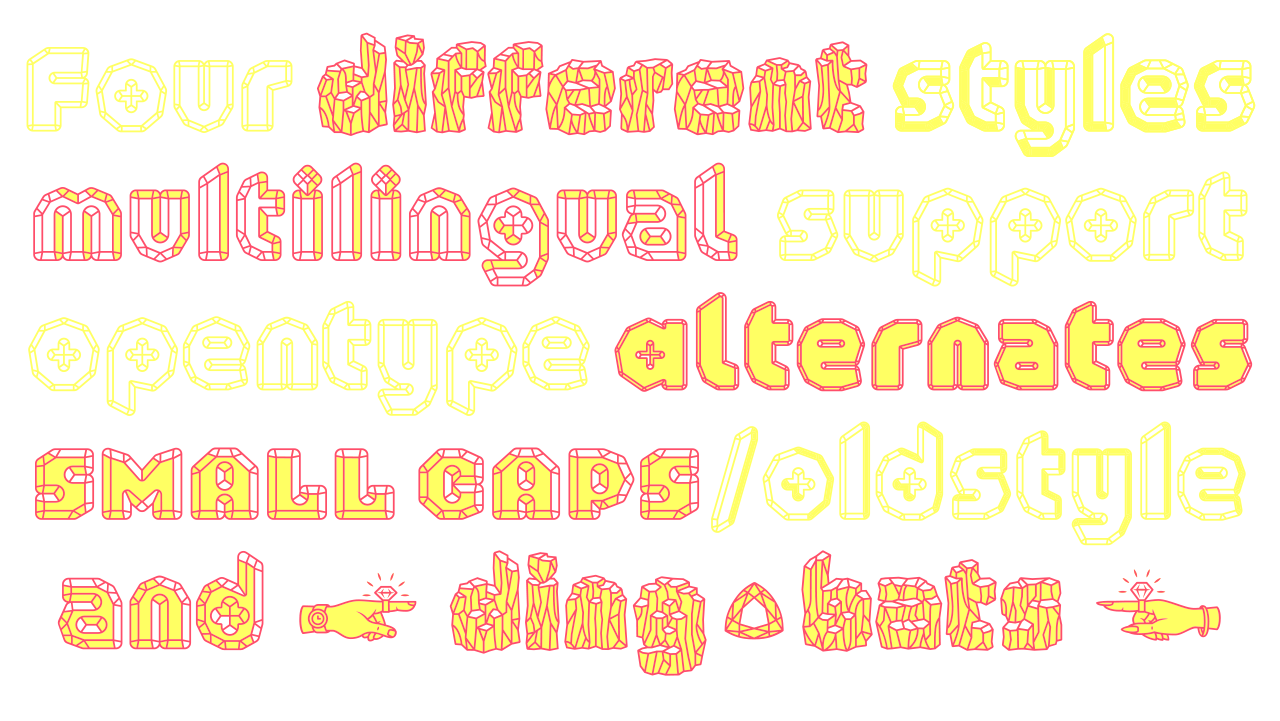
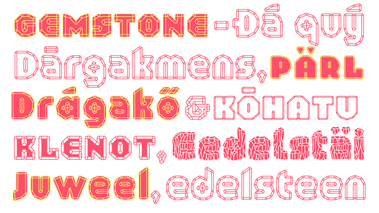
Small capitals, an array of layering styles and alternate glyphs enable you to make every word unique. This makes Schijn, together with it’s wide language support an extremely usable display typeface.
The perfect cut
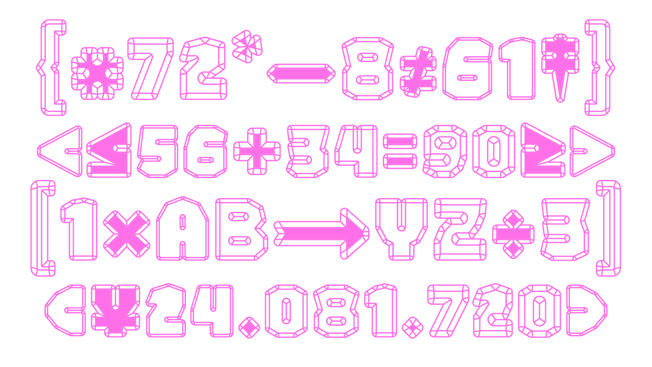
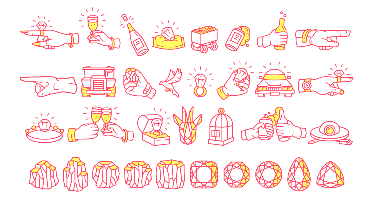
But a display typeface is no good without character support beyond the A to Z. Math symbols, Tabular & Old-style numerals, arrows and a wide range punctuation: All these characters together make Schijn a complete package. Lastly, the set of dingbats solidifies the concept behind Schijn, a font that lives both in the world of toil and that of glamour.
A cut between
The dingbats of Schijn tell a tale from two sides: The Rough weight puts the focus on the world of gemstone mining: The danger, the mistreatment, the pollution. In contrast, the cut variant only contains the world of glamour surrounding the wearables: The excess and vanity.
Schijn contains contrast, but not like broad nib or split pen, it’s contrasts are limo to dump-truck and champagne to water.