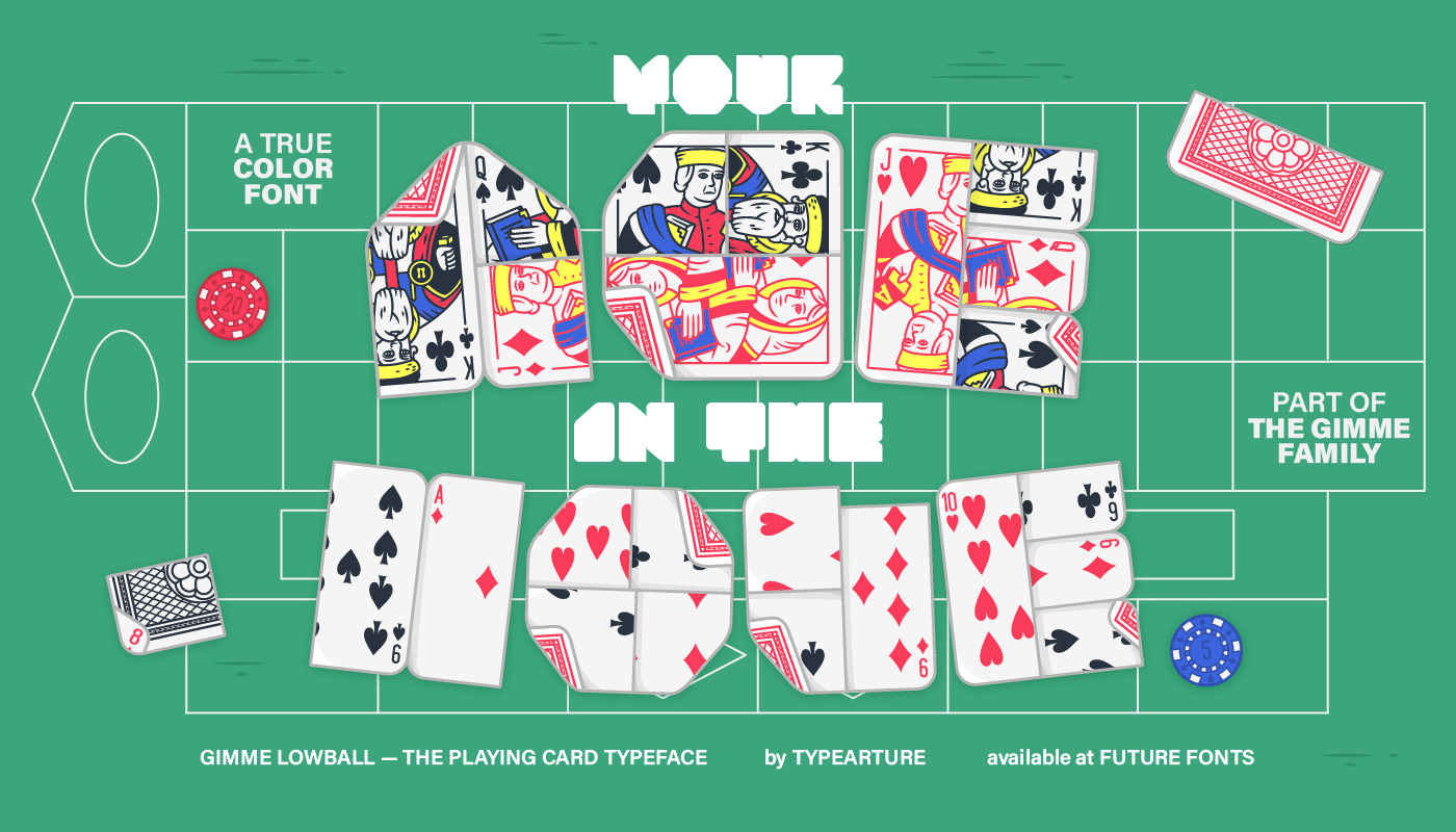
It’s time to shuffle your deck, play your cards or fold your hand:
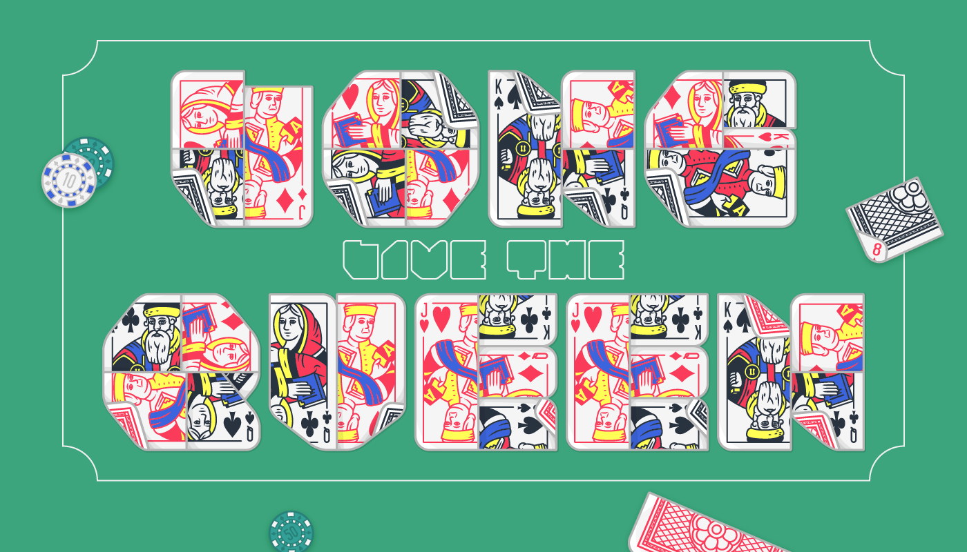
All bets are off with the typographic ace that is LOWBALL, the playing card font.
Part of the GIMME type family, Lowball pushes color font technology to its limits,
transforming the well known deck of cards into a typographic workhorse.
Lowball by Typearture, Available at Future Fonts
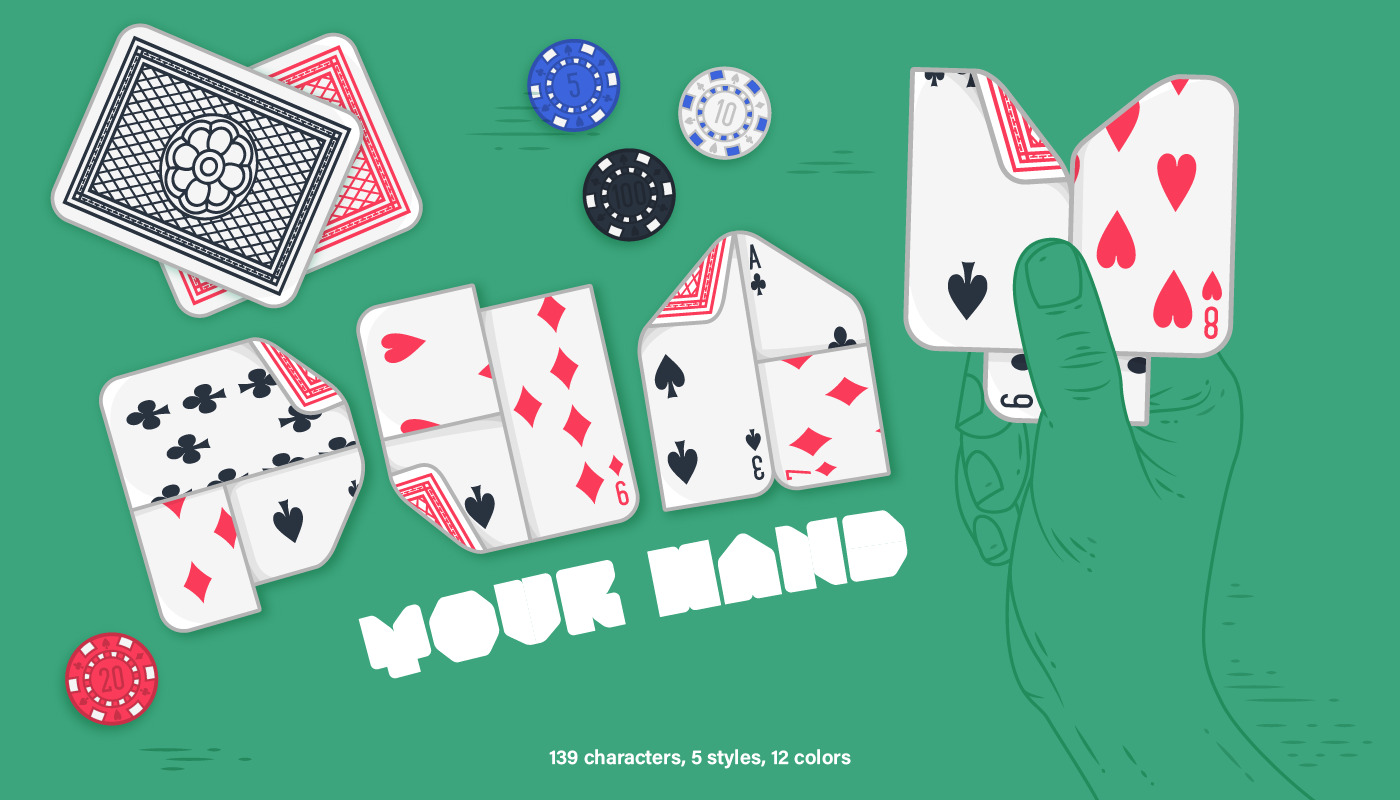
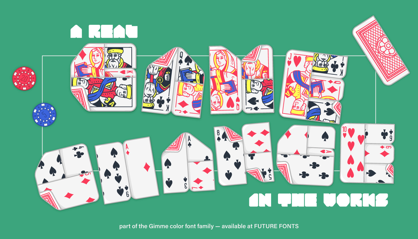
Lowball is a vibrant typeface, made for illustrative or editorial use,
and consists of 5 styles, 139 characters, 12 color layers and a stylistic set.
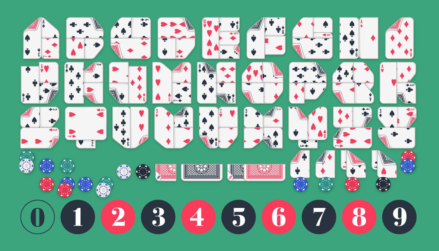
Close attention te detail has been given to make each character fit the concept: From the basic ABC to its punctuation and numerals.
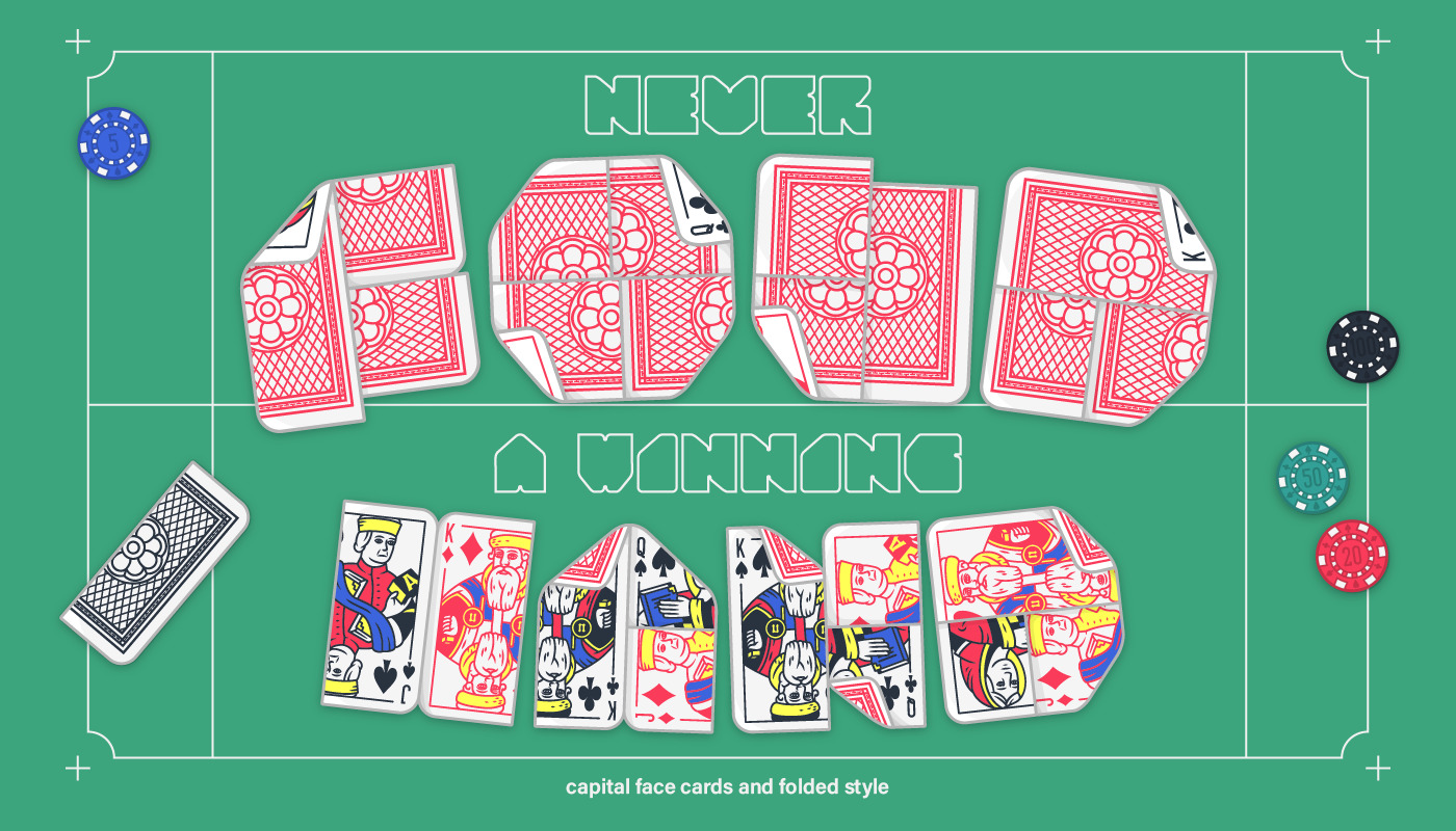
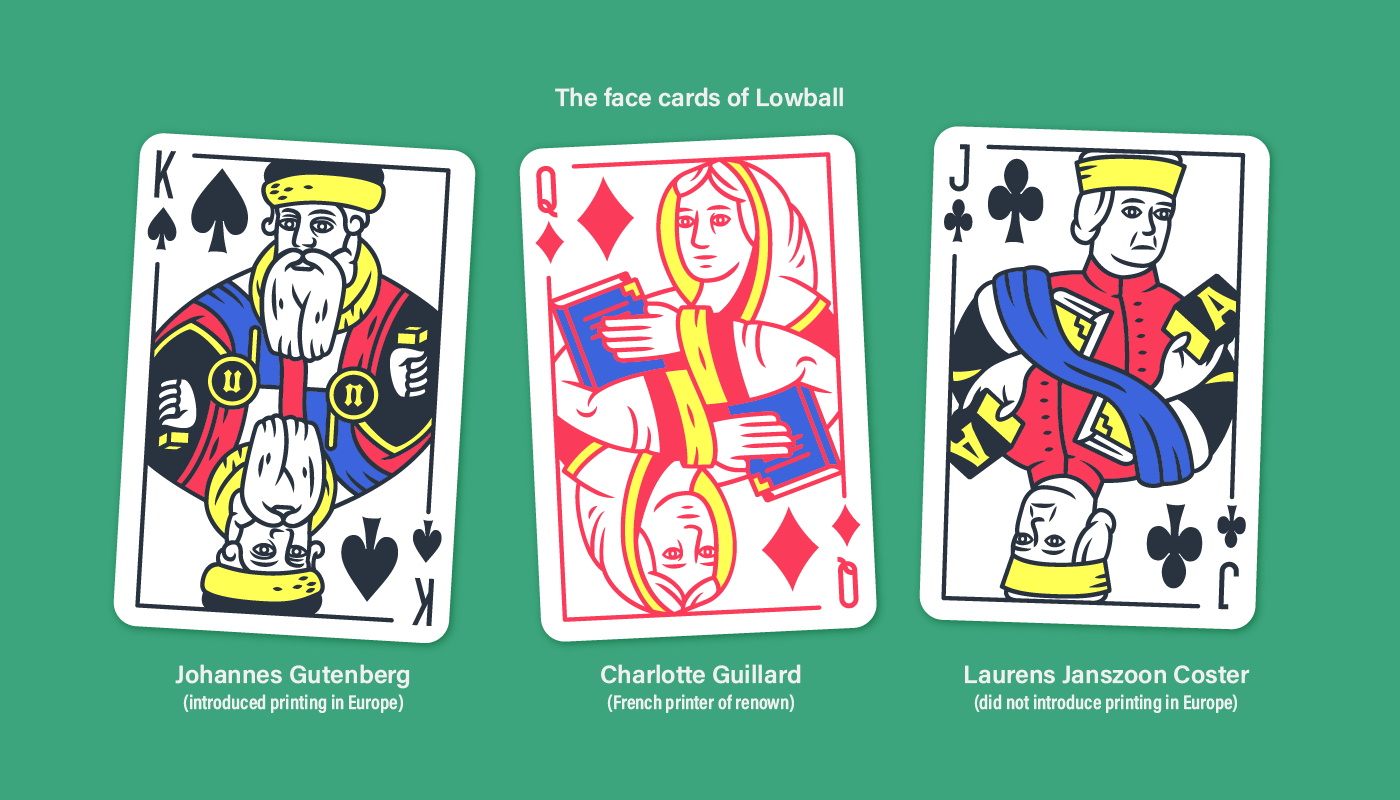
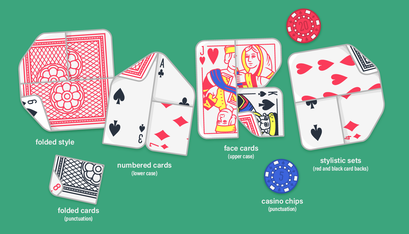
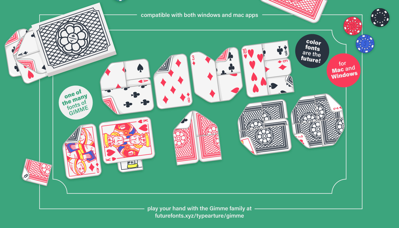
The Lowball character set consists of upper and lowercase capitals, each with their own style. Face cards, the King, Queen and Jack, are folded into capitals, while the lower case capitals are made out of number cards. And finally casino chips gain some value, as they are used for punctuation.
Done playing? Just set your text in the Fold weight and it’s game over!
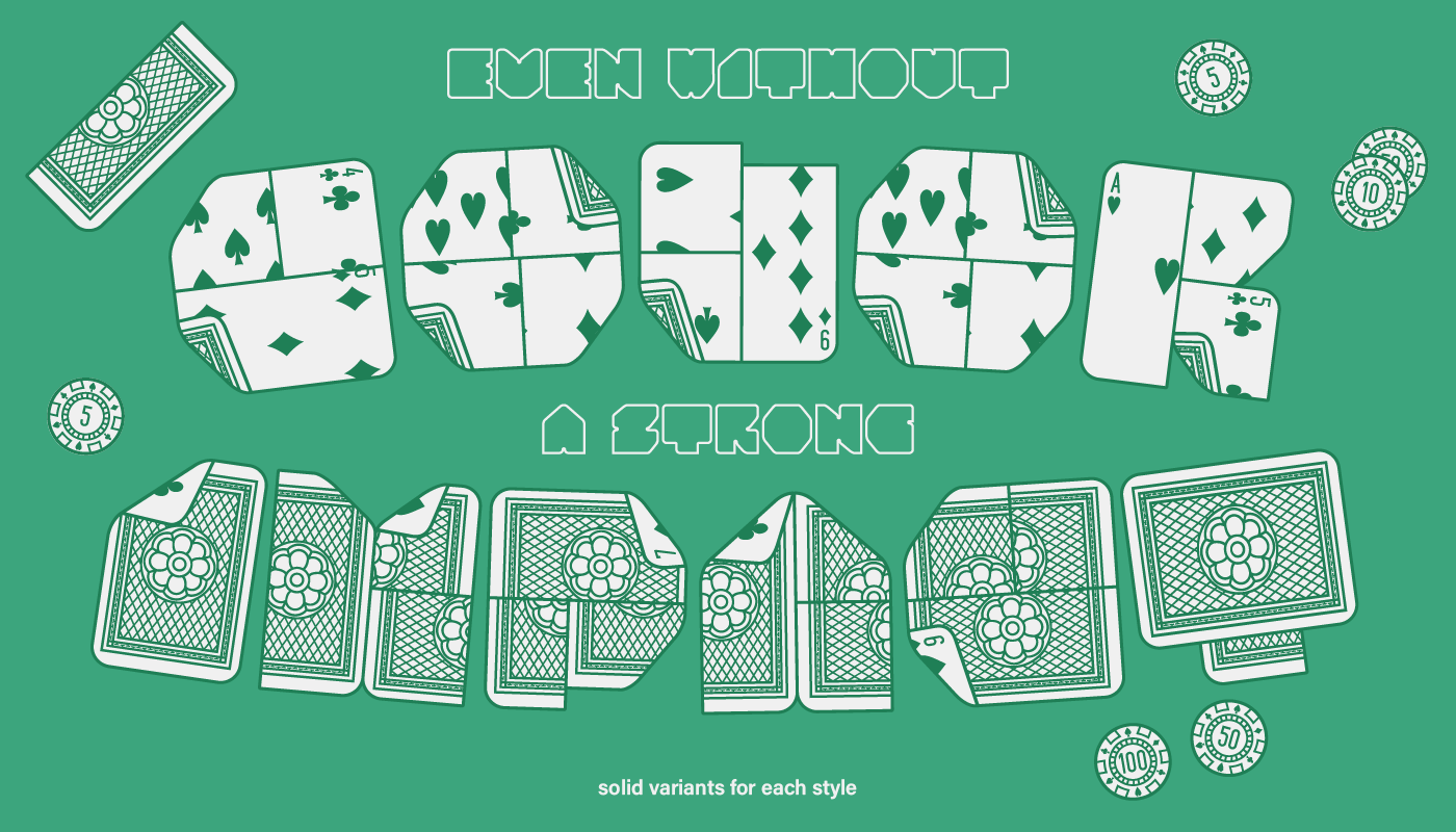
And Lowball isn’t just a color playing card font, as it comes with three extra styles:
Solid, Solid Play and Solid Fold. These styles, developed for monochrome use make layering simple, due to their interchangeable metrics, and allow you to focus on the important task: making the best combination!
Lowball is part of the Gimme font family, a font in progress, available at Future Fonts. It currently includes 8 other color fonts, 2 of which are experimental variable color fonts. So it’s time to place your bets, as all future updates is on the house!
Lowball by Typearture, Available at Future Fonts
A note on color fonts